

Are Global Methane Emissions Really Going Down?
When going down is really going up and other methane paradoxes
The two greenhouse gasses (GHG) that are the primary drivers of climate change are carbon dioxide (CO2) and methane (CH4). This post is about methane.
Each molecule of methane is about 120 times as powerful at heating the planet as a single molecule of CO2. However, while a molecule of CO2 may have an atmospheric lifetime of thousands of years, a molecule of methane is likely to be very short-lived. The best estimate I’ve seen for the expected longevity of a methane molecule is an atmospheric half-life of about 110 months.
This is not properly a “half-life” because methane is not decaying in the typical radioactive sense. The phrase “atmospheric lifetime” may be more appropriate. The methane molecule wanders around in the atmosphere and sooner or later reacts with a hydroxyl radical and goes “poof” (pardon my technical language). Variations in hydroxyl radical concentrations and other atmospheric pollutants can directly impact this lifetime. But, for the purpose of this article, we’re sticking with 110 months.
Because of this short lifetime, you may hear climate scientists say that methane has about 28 times the warming power of CO2 over 100 years, or 82 times over 20 years. This is known as the ‘global warming potential’ of methane, or GWP. It is a way of saying that the methane molecule will warm the planet at a rate of 120× that of CO2 until it gets oxidized, while factoring in the expected lifetime of that methane molecule.
You have no doubt seen the Keeling curve for CO2, updated monthly by NOAA, which has tracked the average monthly amount of atmospheric CO2 at the Mauna Loa observatory since March, 1958. Here is the latest version, with data through April, 2026:
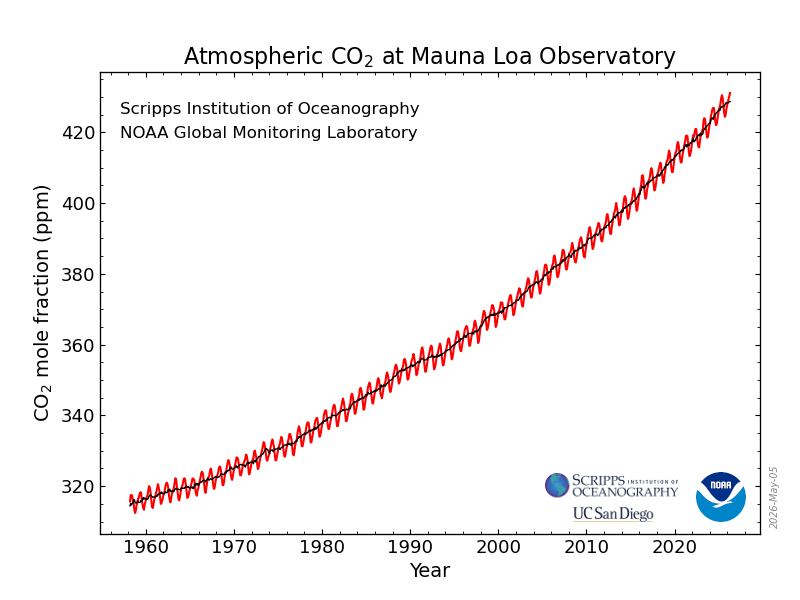
Because a molecule of CO2 has essentially an infinite lifetime by comparison to the other major GHGs, we don’t have to worry about its half-life or oxidation. CO2 has a GWP of 1. If we want to know the rate of growth of CO2 then it’s roughly the same as the amount emitted, at least on an annualized (12-month average) basis, and that’s a simple subtraction problem.
According to NOAA,
The annual mean rate of growth of CO2 in a given year is the difference in concentration between the end of December and the start of January of that year. If used as an average for the globe, it would represent the sum of all CO2 added to, and removed from, the atmosphere during the year by human activities and by natural processes.
In other words, the annual mean rate of growth of CO2 in a given year is the difference between the CO2 concentration at the start of January and end of December of that year. For example, the growth rate for CO2 in 2025 was 2.23 ppm.
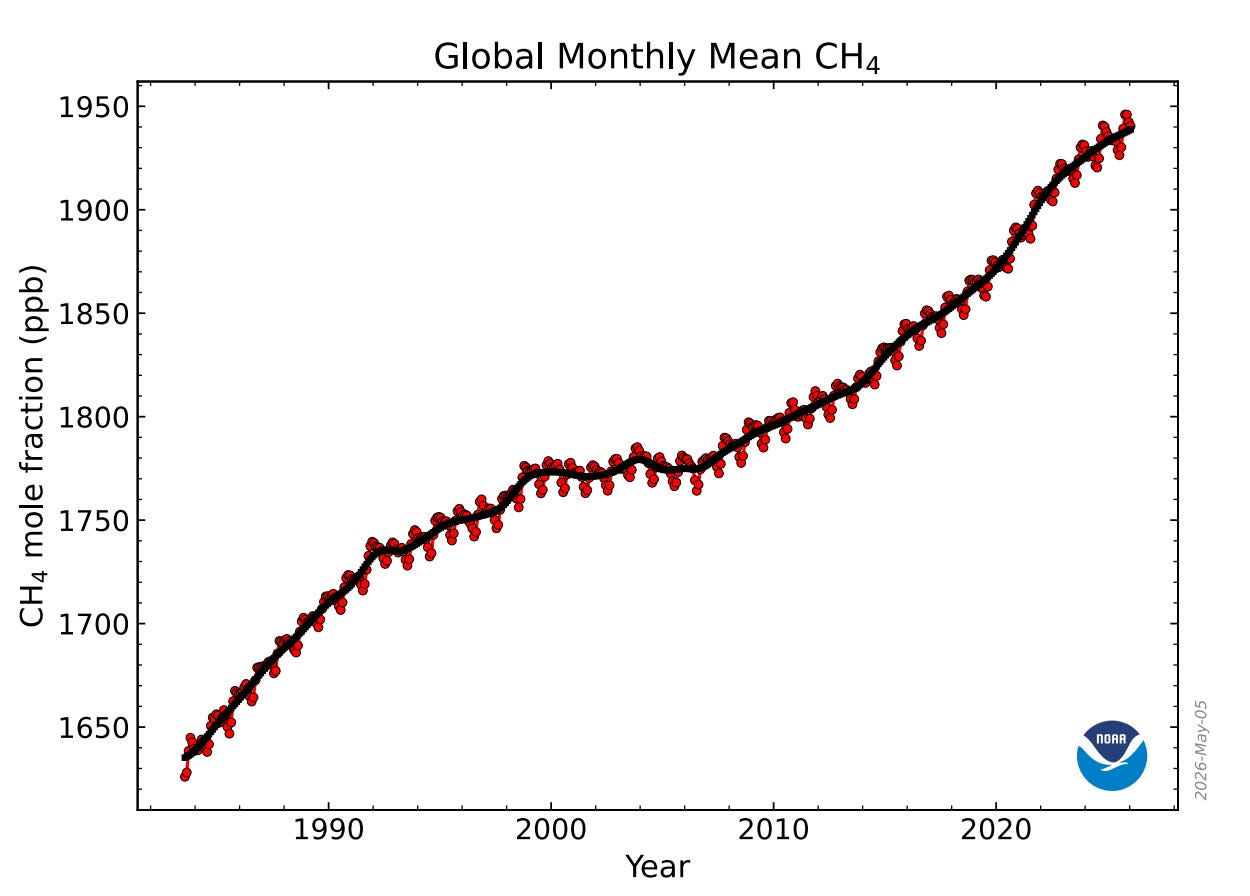
NOAA also produces a monthly growth curve for atmospheric methane like the Keeling curve. The data for methane begins in 1983. Here is the latest, showing a monthly concentration at 1940.43 ppb as of January, 2026:
What is not the least bit clear is how to track the rate of growth and associated emissions rate for methane, given its short atmospheric lifetime. As far as growth rate, NOAA duplicated what it did for CO2, and made it a simple annualized subtraction problem.
“The annual increase in atmospheric CH4 in a given year is the increase in its abundance (mole fraction) from January 1 in that year to January 1 of the next year, after the seasonal cycle has been removed (as shown by the black lines in the figure above). It represents the sum of all CH4 added to, and removed from, the atmosphere during the year by human activities and natural processes. ”
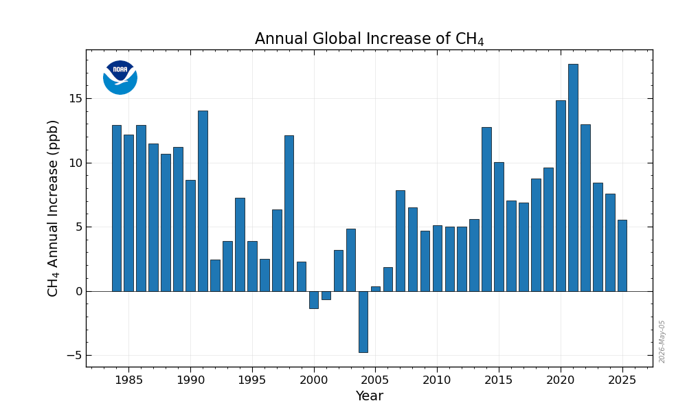
Here is the latest “rate of growth” curve they show on their website.
So, what’s the problem with emissions? Let me give a hypothetical example.
Suppose we have an atmospheric gas with a half-life of 1 year. Suppose we take measurements and find that the concentration of the gas at the start of the year was 1000 ppm. We measure again at the start of the next year and find it is still 1000 ppm. How much of that gas was emitted? Because of the half-life, we know that 500 ppm decayed (half-life of 1 year). So to keep the value at 1000 ppm, there had to be an additional 500 ppm emitted into the atmosphere.
Now suppose that gas is measured at the start of the year at 2000 ppm and at the start of the next year we find it is still 2000 ppm. Again, zero growth, but now 1000 ppm had to be emitted to keep it at the same level.
This hypothetical is exactly what’s happening with measuring methane emissions. As the atmospheric concentration of methane continues to rise, just to keep the concentration at the same level from one year to the next requires an increasing amount of methane be emitted.
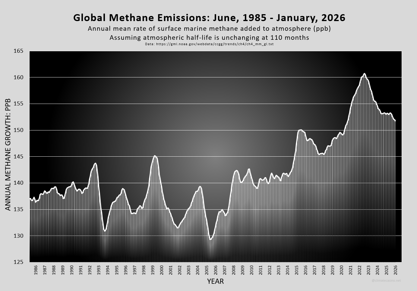
Before I tell you how I did it, here is what I got for the actual rate of emitted methane. The latest annualized emission rate, as of January, 2026, was 151.8 ppb per year. The peak yearly emission rate was 160.7 ppb in August, 2022.
Did emissions really fall? Did COVID cause that 2022 spike? If we look pre-COVID, and go back to January, 2020, then the annualized emission rate was 149.3 ppb. Have methane emissions gone up (from 2020) or down (from 2022)?
Methodology
I first grabbed the CH4 data from NOAA, which is current through January, 2026. There is something called “reanalysis” that delays these values by approximately 4 months. It’s frustrating to get January’s value in May, but that’s how it goes with methane.
Onto the analysis. First, the IPCC in AR5 stated that atmospheric methane has a half-life of 9.1 years. That means that half of all methane in the atmosphere at any given moment will cease to exist roughly every 110 months. There is a simple equation that describes, given how much methane we have at any initial moment, how much will persist after any specified amount of time has passed. This is called “exponential decay” and is one of the simplest math ideas students learn in their first year of undergraduate calculus.
To put it super-simply, if you know the amount of CH4 in a given month, call it “old methane”, then the amount of that CH4 that will still be present the following month is approximately given by:
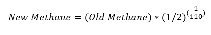
For simplicity, that weird term (1/2) to the power (1/110) is equal to about 0.993718. This means that each month the atmosphere loses about 0.6282% of the atmospheric methane from the previous month.
For example, NOAA’s methane data stated that in December of 2025, the atmospheric concentration of methane was 1942.36 ppb. Over the next month, natural decay caused about 1942.36 × 0.6282% = 12.20 ppb to fall out of the atmosphere, leaving 1942.36 - 12.20 = 1930.16 ppb by January, 2025. So when NOAA announced a January, 2026 methane value of 1940.43 ppb, then the amount of new methane entering the atmosphere had to be about 1940.43 ppb - 1930.16 ppb = 10.27 ppb.
In other words, even though methane decreased from 1942.36 ppb to 1940.43 ppb, the total cumulative emissions went up by 10.27 ppb. When it goes down, it goes up.
In an effort to smooth out the curve, I didn’t just look at January 1 – December 31, like NOAA’s graph. Rather, to get smoothed values, I used the average concentration of methane over the previous 12 months as the amount of methane in the atmosphere for that particular month. This works because any 12 month period covers all atmospheric conditions that naturally alter methane concentrations and create the wiggle in the growth curve. This forced me to start my plot in 1985, since I needed 12 months backlog to start the smoothing process and another 12 months to begin subtracting values. I then applied the 0.6282% number to the 12 month running average, as illustrated above.
Of course, methane is not radioactive. The decay rate can change over time due to the concentration of hydroxyl radicals, and other atmospheric conditions. In fact, the peak shown in my graphic that occurred in August, 2022 was recently attributed to the lingering impacts of the COVID slowdown on hydroxyl radicals. Read about it here: The curious case of why methane spiked around Covid
At the heart of the story are hydroxyl radicals – highly reactive molecules often described as the atmosphere’s ‘detergent’. These radicals normally break down methane, limiting how long it remains in the atmosphere.
During 2020–2021, however, hydroxyl radicals levels around the world dropped. This is because the ingredients needed to make them were reduced when human activity slowed down.
In other words, according to this study, the 2020-2023 spike was not a result of more methane being emitted. It wasn’t fracking, or animal agriculture, or ESAS or the Siberian permafrost methane bomb. Instead, it was an artifact of the increased atmospheric lifetime of methane. Fewer hydroxyl radicals.
And so it seems that for all practical purposes, comparing January, 2026 to January, 2020, methane emissions are still at or near an all-time high.
Oh, and a disclaimer. I am not an atmospheric scientist. I am not at all sure this methodology is sound. But it seems okay to me. If you are an atmospheric scientist and want to drop me a note, please! I am eager to hear from you.
For someone who claims not to be a climate scientist, the professor does a great job describing and defining what's going on over our heads.
ThankU Professor Jacobson
So the reduction of hydroxyl radicals is like another "termination shock" associated with reduced fossil fuel combustion, along with the reduction of the combustion pollution that maintains higher cloud albedo. Oh, dear.